


 AI智能应用开发
 AI大模型开发(Python)
 AI鸿蒙开发
 AI嵌入式+机器人开发
 AI运维
AI运维 AI测试
AI测试 跨境电商运营
 AI设计
AI设计 AI视频创作与直播运营
 微短剧拍摄剪辑
 C/C++
C/C++ 狂野架构师
狂野架构师


transition-property属性有几个属性值?
更新时间:2021年11月01日12时24分 来源:传智教育 浏览次数:
transition-property属性用于指定应用过渡效果的CSS属性的名称,其过渡效果通常在用户将指针移动到元素上时发生。当指定的CSS属性改变时,过渡效果才开始。其基本语法格式如下。
transition-property:none | all | property;
transition-property属性有几个属性值?transition-property属性的取值包括 none、all和property 三个,具体说明如下所示。
none: 没有属性会的会获得过渡效果;
all: 所有属性都将获得过渡效果
property: 定义应用过渡效果的CSS属性名称,多个名称之间用逗号分隔。
下面通过一个案例来演示transition-property属性的用法,如下代码所示:
<!DOCTYPE html>
<html lang="en">
<head>
    <meta charset="UTF-8">
    <meta http-equiv="X-UA-Compatible" content="IE=edge">
    <meta name="viewport" content="width=device-width, initial-scale=1.0">
    <title>transition-property属性</title>
    <style>
        div{
            width: 400px;
            height: 100px;
            background-color:red;
            text-align: center;
            line-height: 100px;
            font-weight: bold;
            color: #fff;

        }
        div:hover{
            background-color: blue;
            /* 指定动画过渡的CSS属性 */
            -webkit-transition-property: background-color;
            /* Safari andChrome浏览器兼容代码 */
            -moz-transition-property: background-color;
            /* Opera浏览器兼容代码 */
            -o-transition-property: background-color;
        }
    </style>
</head>
<body>
    <div>使用transition-property属性改变元素背景色</div>
</body>
</html>
在上面案例中,通过transition-property属性指定产生过渡效果的CSS属性为background-color,并设置了鼠标移上时背景颜色变为蓝色,如第14~15行代码所示。另外,为了解决各类浏览器的兼容性问题,分别添加了-webkit-、-moz-、-o-等不同的浏览器前缀兼容代码。
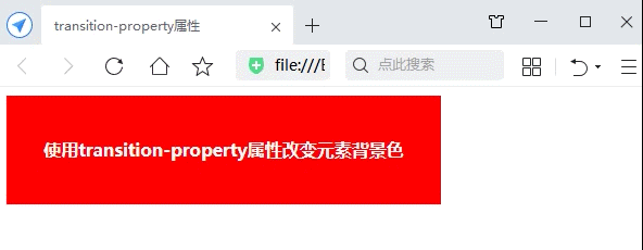
运行案例代码,默认效果如下图所示。

当鼠标指针悬浮到网页中的<div>区域时,背景色立刻由红色变为蓝色,如图所示,而不会产生过渡。这是因为在设置“过渡”效果时,必须使用transition-duration属性设置过渡时间,否则不会产生过渡效果。
ransition-duration属性用于定义过渡效果花费的时间,默认值为0,常用单位是秒(s)或者毫秒(ms),其基本语法格式如下。
transition-duration: time;
通过transition-duration属性,添加3秒中的延时。
<style>
    div{
        width: 400px;
        height: 100px;
        background-color:red;
        text-align: center;
        line-height: 100px;
        font-weight: bold;
        color: #fff;
    }
    div:hover{
        background-color: blue;
        /* 指定动画过渡的CSS属性 */
        -webkit-transition-property: background-color;
        /* 设置设置过渡时为3秒,如果不设置默认为0,将不会看到过渡效果 */
        transition-duration: 3s;
        /* Safari andChrome浏览器兼容代码 */
        -moz-transition-property: background-color;
        /* Opera浏览器兼容代码 */
        -o-transition-property: background-color;
    }
</style>
添加延时后的效果:
猜你喜欢
最新资讯


江苏传智播客教育科技股份有限公司 版权所有Copyright 2006-2024 All
Rights Reserved
苏ICP备16007882号营业执照增值电信业务经营许可证出版物经营许可证 苏公网安备 32132202001156号
免费领取黑马程序员AI通道专属星级课程资料
